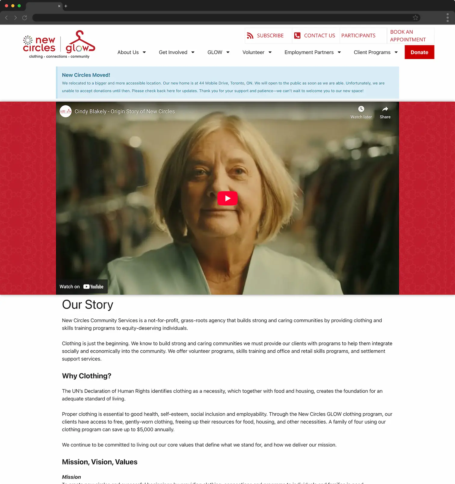
/ Homepage video
Transformed a fragmented menu system into a clear, task-oriented hierarchy.
/ Sitemap before and after
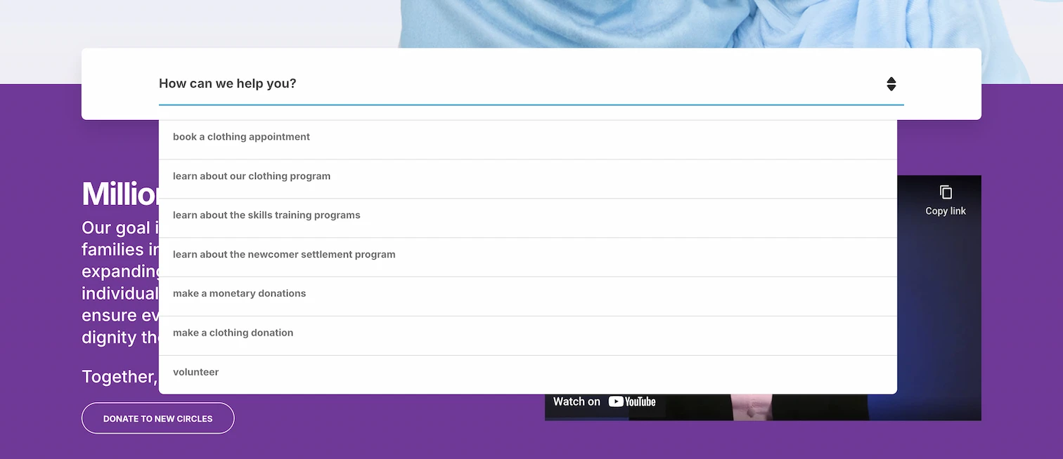
A contextual dropdown in the hero with the most common user requests, allowing visitors to bypass top-level navigation and reach key actions in one step.
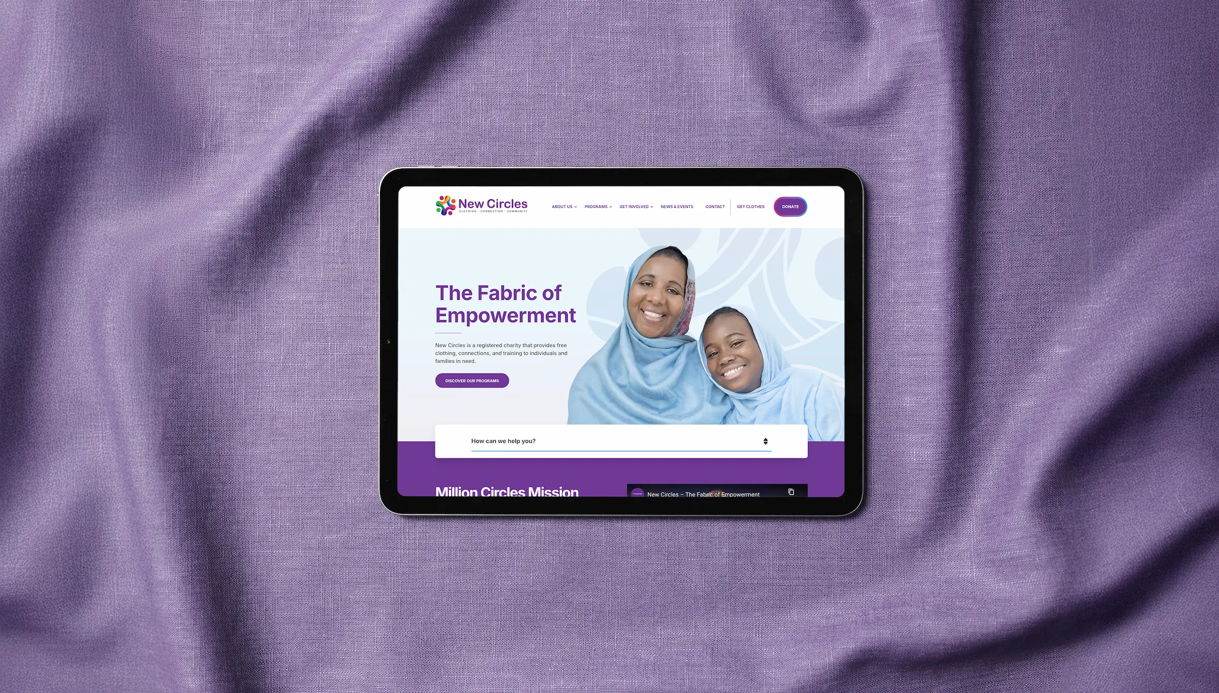
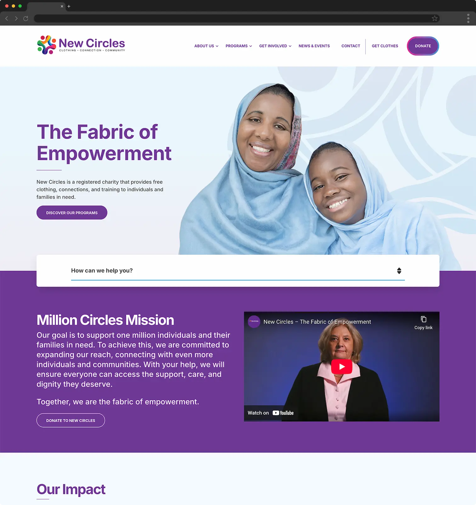
/ Homepage
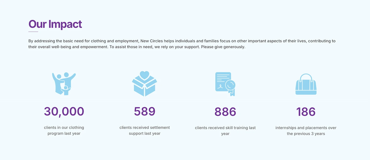
Community impact metrics are highlighted across key pages to make outcomes immediately visible.
/ Homepage
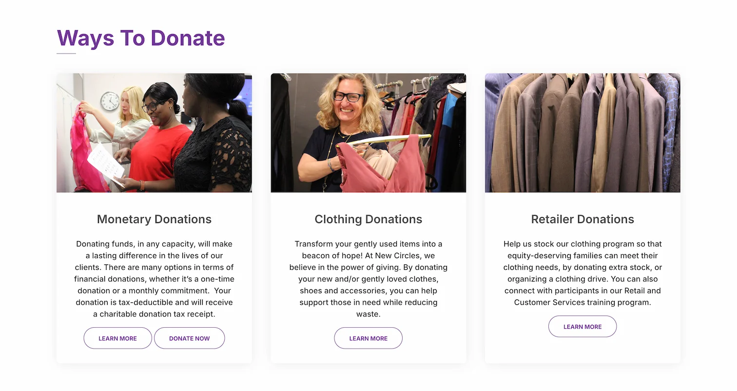
Made donation paths immediately scannable and self-selecting.
/ Donate

Before
After
Design Rationale & Key Decisions
01. Reorganize navigation around user intent
The previous navigation structure reflected internal program naming rather than how users naturally look for help, making it harder for visitors to quickly identify relevant pathways. Through a card-sorting exercise and iterative refinement, the navigation was restructured to group content more intuitively—particularly within Programs and Get Involved—while simplifying labels to improve clarity and accessibility for New Circles' diverse, multilingual audience.
02. Design the information architecture to support multiple audiences
New Circles' core audience is individuals arriving in Canada for the first time, often navigating unfamiliar systems while seeking skills training and clothing support. The site structure was designed to meet these users first, while still supporting donors, volunteers, and corporate partners within a single cohesive framework.
03. Surface donation options as clear, self-selectable pathways
Donations are essential to New Circles' sustainability, yet the previous Donate page provided little visual guidance. For the rebuild, donation types were elevated and grouped by intent near the top of the page, enabling visitors to immediately identify their preferred method of giving.
04. Make impact visible and tangible
New Circles' community impact was not immediately apparent, as key metrics were embedded within long-form content. Impact statistics were elevated and integrated across multiple pages to reinforce credibility, communicate outcomes more clearly, and help donors understand the real-world results of their contributions.
05. Encourage deeper exploration through contextual cross-linking
Many pages previously existed in isolation, limiting discovery and engagement. Related programs and actions were intentionally surfaced across the site—particularly within Skills Training and Get Involved sections—creating natural pathways for users to continue exploring relevant offerings while supporting overall SEO performance.